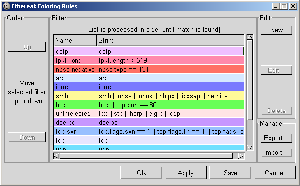
Ethereal-dev: [Ethereal-dev] Color Dialog design proposal (minor changes only)
Note: This archive is from the project's previous web site, ethereal.com. This list is no longer active.
- Follow-Ups:
- Re: [Ethereal-dev] Color Dialog design proposal (minor changes only)
- From: Erwin Rol
- Re: [Ethereal-dev] Color Dialog design proposal (minor changes only)
- From: Richard Urwin
- Re: [Ethereal-dev] Color Dialog design proposal (minor changes only)
- From: John McDermott
- Re: [Ethereal-dev] Color Dialog design proposal (minor changes only)
- Prev by Date: Re: [Ethereal-dev] cvsversion.h isn't generated in MSVC Makefile.nmake
- Next by Date: Re: [Ethereal-dev] Color Dialog design proposal (minor changes only)
- Previous by thread: Re: [Ethereal-dev] CVS: nothing known about image/ethereal.icns
- Next by thread: Re: [Ethereal-dev] Color Dialog design proposal (minor changes only)
- Index(es):
